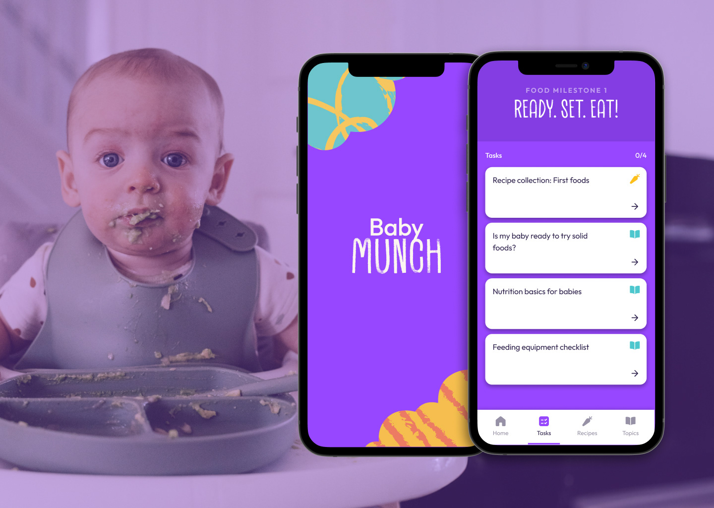
Navigating the introduction of solid foods for their little one can be a daunting experience for many parents. Feeling overwhelmed by conflicting information, time constraints, and anxieties related to safety and development, parents often grapple with a lack of practical guidance and ongoing support. This case study delves into the design process of Baby Munch, a mobile app developed to address these very concerns, empowering parents with a data-driven, simple, and personalised approach to their baby's first food journey.
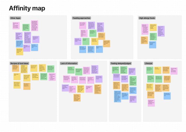
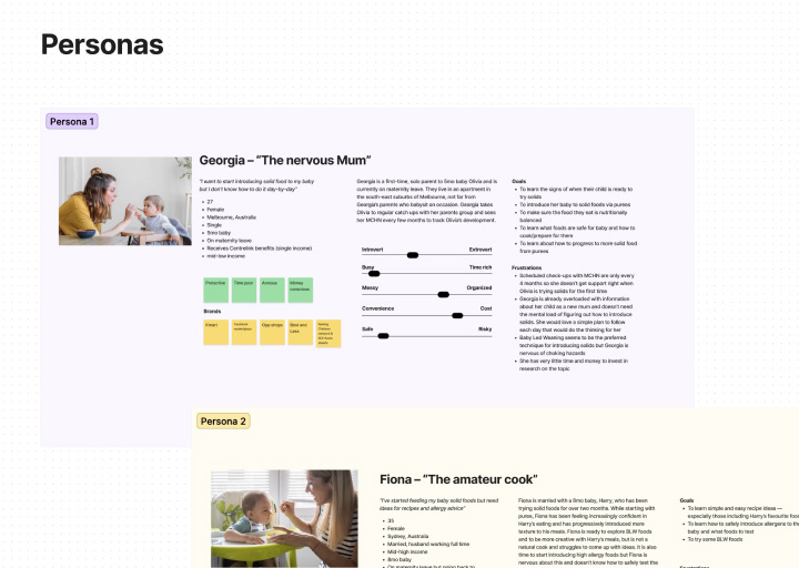
Through in-depth user research, including interviews with solo and experienced parents across diverse demographics, Baby Munch identified key pain points surrounding the introduction of solids. Parents expressed a need for readily available, evidence-based information, anxiety about choking and allergies, and a general lack of time and confidence navigating the process. Georgia, a 27-year-old first-time mother in Melbourne, became the primary persona, embodying the challenges these parents face.
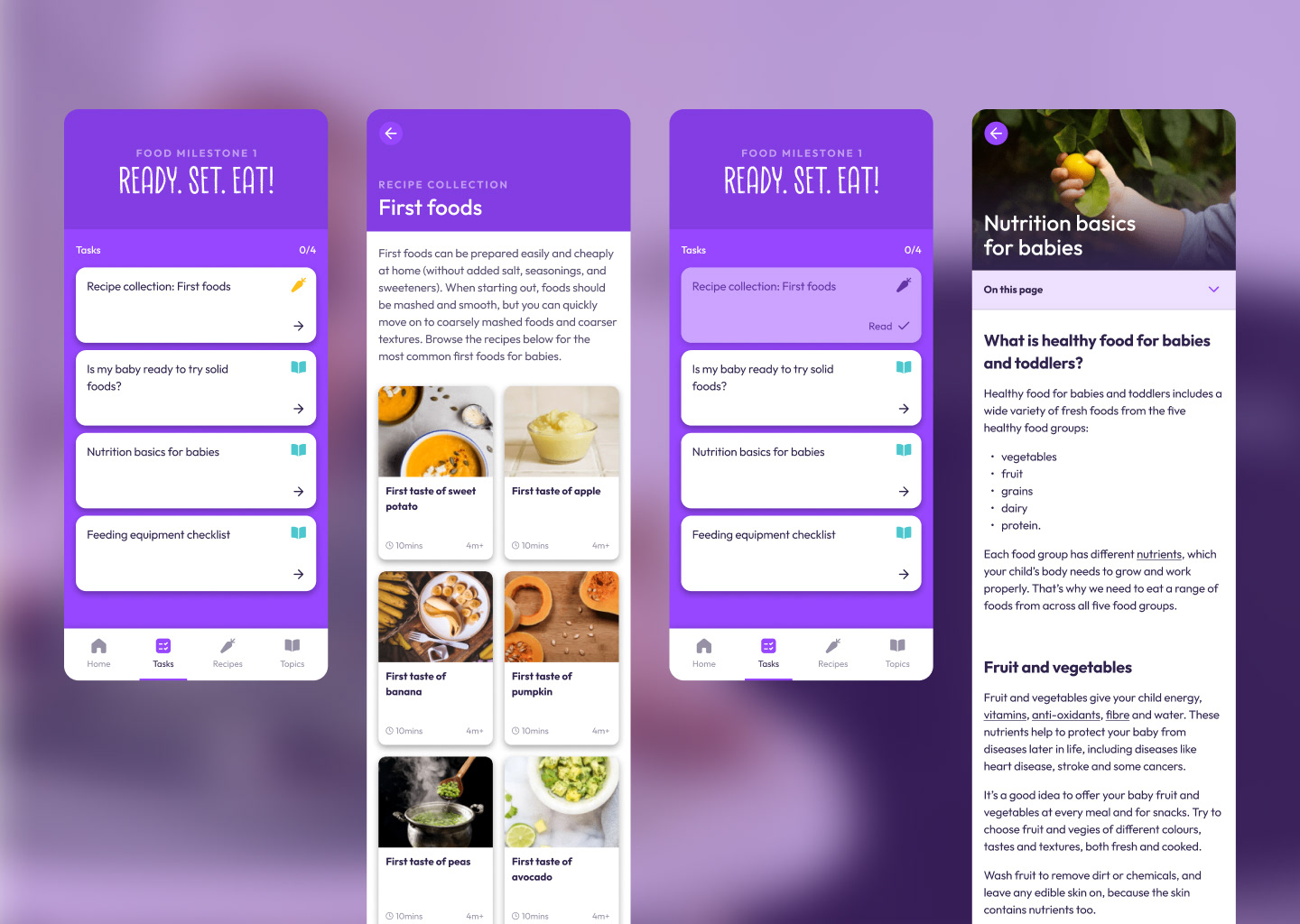
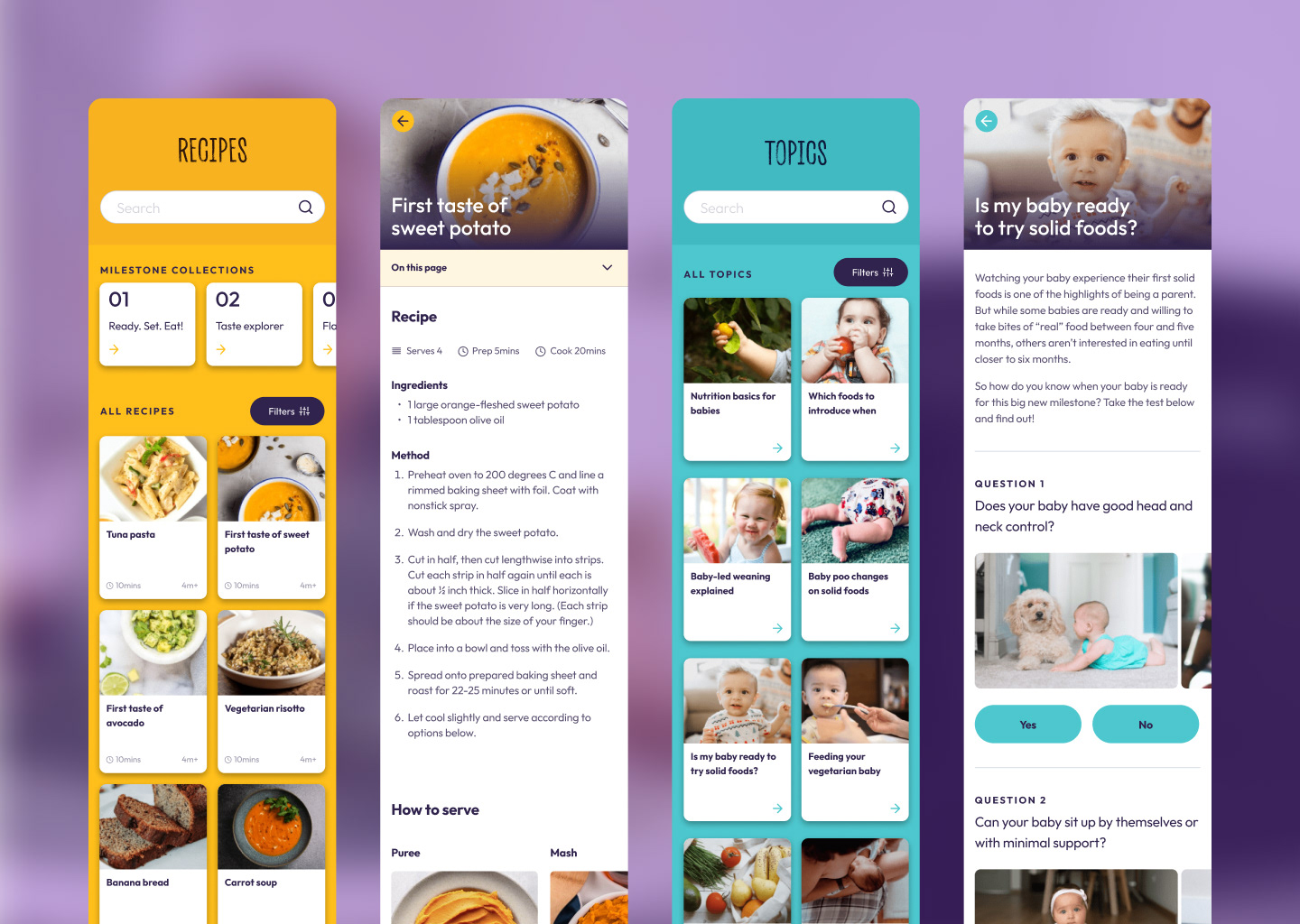
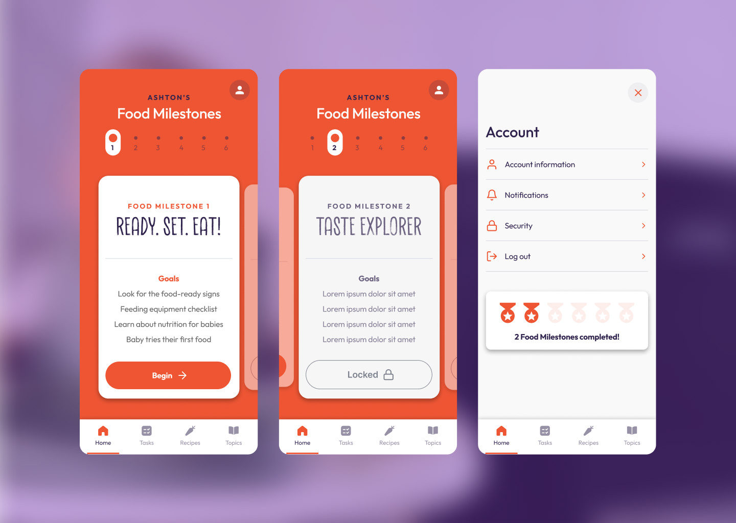
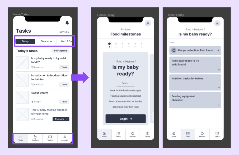
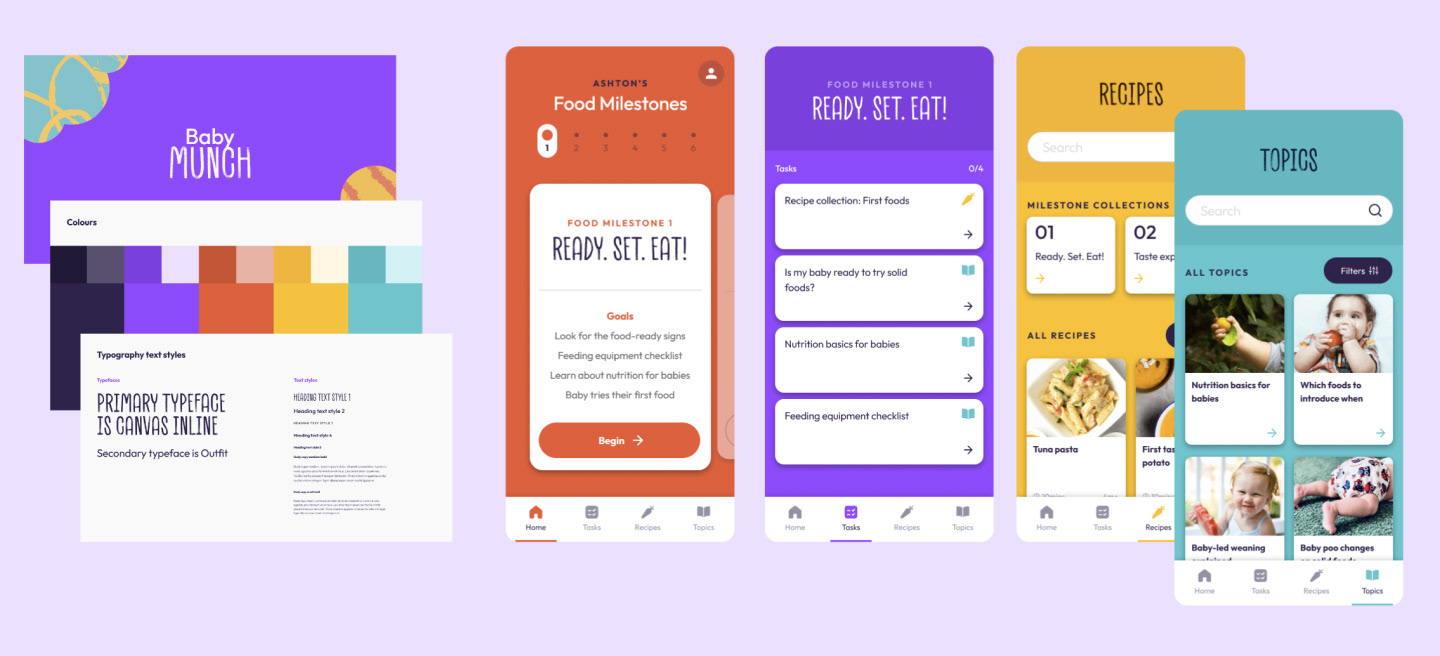
Baby Munch tackles these issues by offering a structured plan, broken down into manageable ‘bite-size’ tasks, that progresses alongside the baby's development. This food milestone framework removes the burden of planning and decision-making for parents, empowering them to focus on the joyful moments of introducing new flavours and textures. The app features an easily searchable recipe index, educational resources, and a personalised account page, all wrapped in a clean and intuitive interface designed to minimise stress and maximise convenience.
This case study explores the iterative design process behind Baby Munch, from initial research and persona development to wireframing, user testing, and high-fidelity design.
Baby Munch is an app created in response to a UX course assignment with General Assembly Australia.
Skills:
— UX/UI design
— UX research
— Usability testing
— User interviews
— User persona development
— Prototyping
— Wireframing & high-fidelity designs
— UX research
— Usability testing
— User interviews
— User persona development
— Prototyping
— Wireframing & high-fidelity designs
User research
— 6 in-person interviews with parents (solo, experienced, first-time, working)
— Identified recurring problem areas: lack of info & support, feeling judged, recipe & food ideas, choking/allergy anxiety, overwhelmed & time-poor
— Defined primary persona: Georgia (27, solo first-time parent with 5mo baby) and her frustrations (infrequent check-ups, info overload, BLW concerns, limited time & money)
Parents need evidence-based, simple, and practical guidance when introducing solid foods to their baby because they are often overwhelmed, time-poor and lack on-going support. How might we create a plan for parents to follow when first introducing solids to their baby?
Ideation & Prioritisation
— Daily tasks plan broken down into manageable steps, progressing with baby's development
— Feature prioritisation using 2x2 matrix (main features: daily tasks, recipe & lesson indexes, account page)
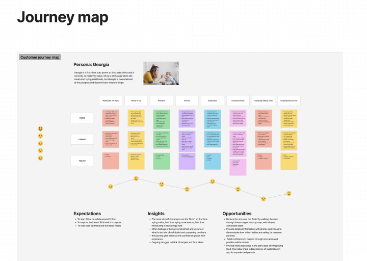
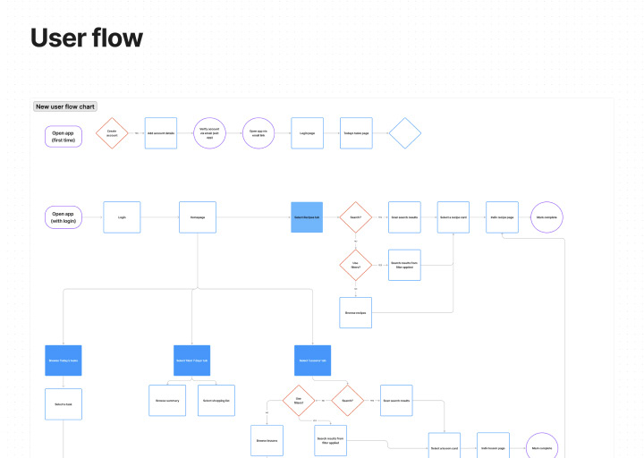
— Exploration of user journey through journey map and user flow to begin building out the architecture of the app
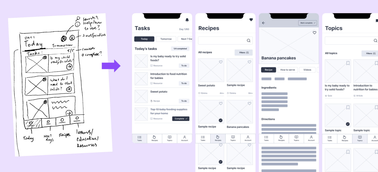
Wireframing & User Testing
— User flows explored for tasks, recipes, and lessons pages
— Low-fidelity wireframes created and tested with 4 participants (unmoderated, in-person)
— Feedback: daily tasks achievable but too much pressure, task completion needs clearer flow
High-Fidelity Design & Final Testing
— Bold colours, contrasting typefaces, tile designs, clean layouts, colourful icons & navigation
— 2 rounds of online usability testing (11 participants)
— Initial test showed success but potential leading questions identified
— Second test confirmed success but revealed minor confusion with recipe flows
Challenges & Future Ideas
— Prioritising features and avoiding "doing it all"
— Translating user feedback into actionable changes
— Wording tasks during testing to avoid bias
— Potential future integrations: notifications, saved recipes/topics, shopping lists, food tracking, allergy plan